ChatGPT, General, Hockey, New Product, News
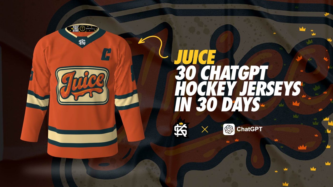
Juice: 30 ChatGPT Hockey Jerseys in 30 Days
May
The What
Welcome to the next installment in the series! Day 4 of 30. We wanted to do an exploration on stylized text, so we came up with ‘Juice‘. Probably the weakest final product in the overall series, but it’s strong enough to feel good about – all the while it works as an example of how we can make ChatGPT work our text logo treatments.
How We Prompted ChatGPT
Here’s the exact prompt we used to get the logo image you see within this post.
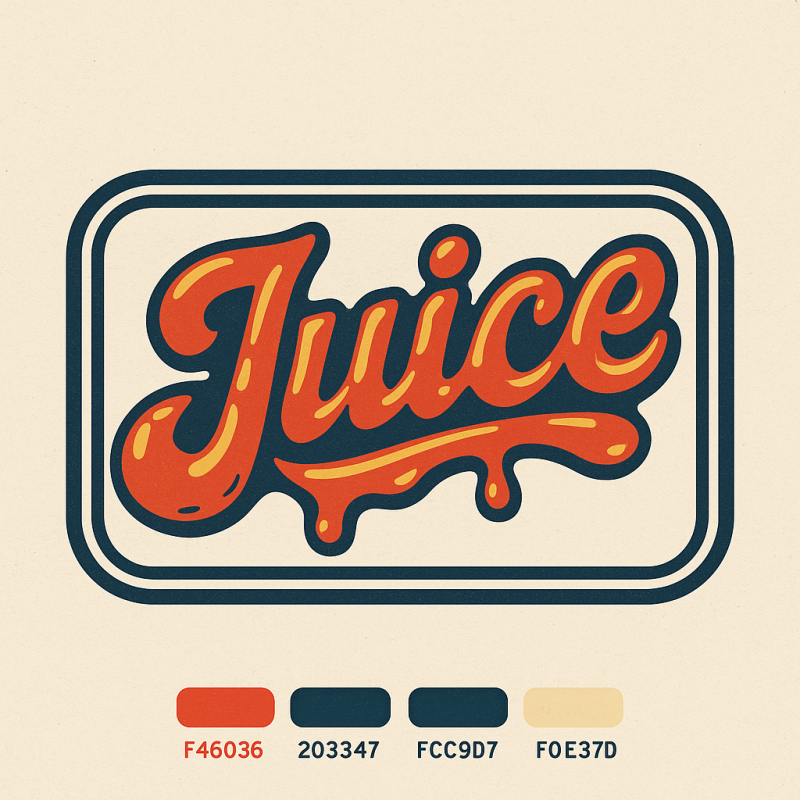
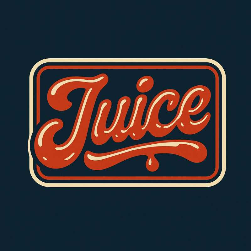
‘I want to make a logo – want it to be a text logo in a vintage/modern style. The logo can also have a border with one or two outlines. For the text logo I’d like the text to be ‘Juice’ and I want it to look like liquid. Choose colors for me that are contrasting. Please only use a maximum of 5 hex colors for the logo.’
Links to the prompt exchange history:
For most use cases, we went with the minimal mascot style logo direction. ChatGPT knows what this is and will mimic the style pretty well. This ensures flat and clean lines with no shading or soft edges. That’s important, we’ll explain why. The final artwork needs to be this way so that we can create a vector image out of the PNG file that ChatGPT provides to you after it renders your ideas. We take the file and load it into a vectorization tool (we recommend vectorizer.ai and Vector Magic to accomplish this on your own – otherwise we can do that step for you after you order – you’re also free to explore other options) to separate the shapes into vectors so that we can colorize freely. This also ensures that we are able to scale the artwork without the loss of resolution. More on that here.
You can request a crest shape to act as a container for your logo, or explicitly ask to not include one. At times we asked for no crest shape since we wanted to have control on that piece on our end after the logo is created. You can also prompt ChatGPT for suggestions – it can really help steer your creative direction.
Be sure to direct the prompt with specific information if you have it – like what sort of emotion you want, what pose, overall shape, and what items the logo should have (i.e. hockey gloves, hockey skates, hockey stick, etc.).
For text, it does a decent job with rendering it out – you will likely experience some anomalies and artifacts with the text, it’s improved in this regard immensely in the time we started using to now. You can choose to let it be generated or to exclude it – just be sure to know what you want to do going into it. We suggest going without it first and adding it when requesting revisions. Experimenting will obviously get you better and better results as you learn how best to get what you want.
Ask for colors you’d like to include. Give general direction with terms like primary, analogous, monochromatic, contrasting – you can even let ChatGPT pick them for you. It’s good to limit the total number of colors in the logo as well – this helps for many reasons. Results in a cleaner file and better contrast. We recommend a maximum of 5-6 colors. Through some experimentation we found that adding the ‘no grain or mottled results’ in the prompt really helps to keep the final image from looking like it has a texture to it.
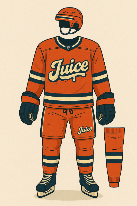
Final Juice Hockey Jersey Results/Product
The concept was straightforward, requiring minimal revisions. Aside from a few color adjustments, the final version remained nearly untouched. View the full progression in the gallery below. As we’ve mentioned before, this series is an exploration of what’s possible—not a substitute for illustrators.
As you may or may not be aware, we are releasing a new design concept daily. Be sure to order yours now and check out the rest of the collection as it grows! Provide feedback and share your own results as well!

Hockey