ChatGPT, General, Hockey, New Product, News
Goal Diggers: 30 ChatGPT Hockey Jerseys in 30 Days
The What
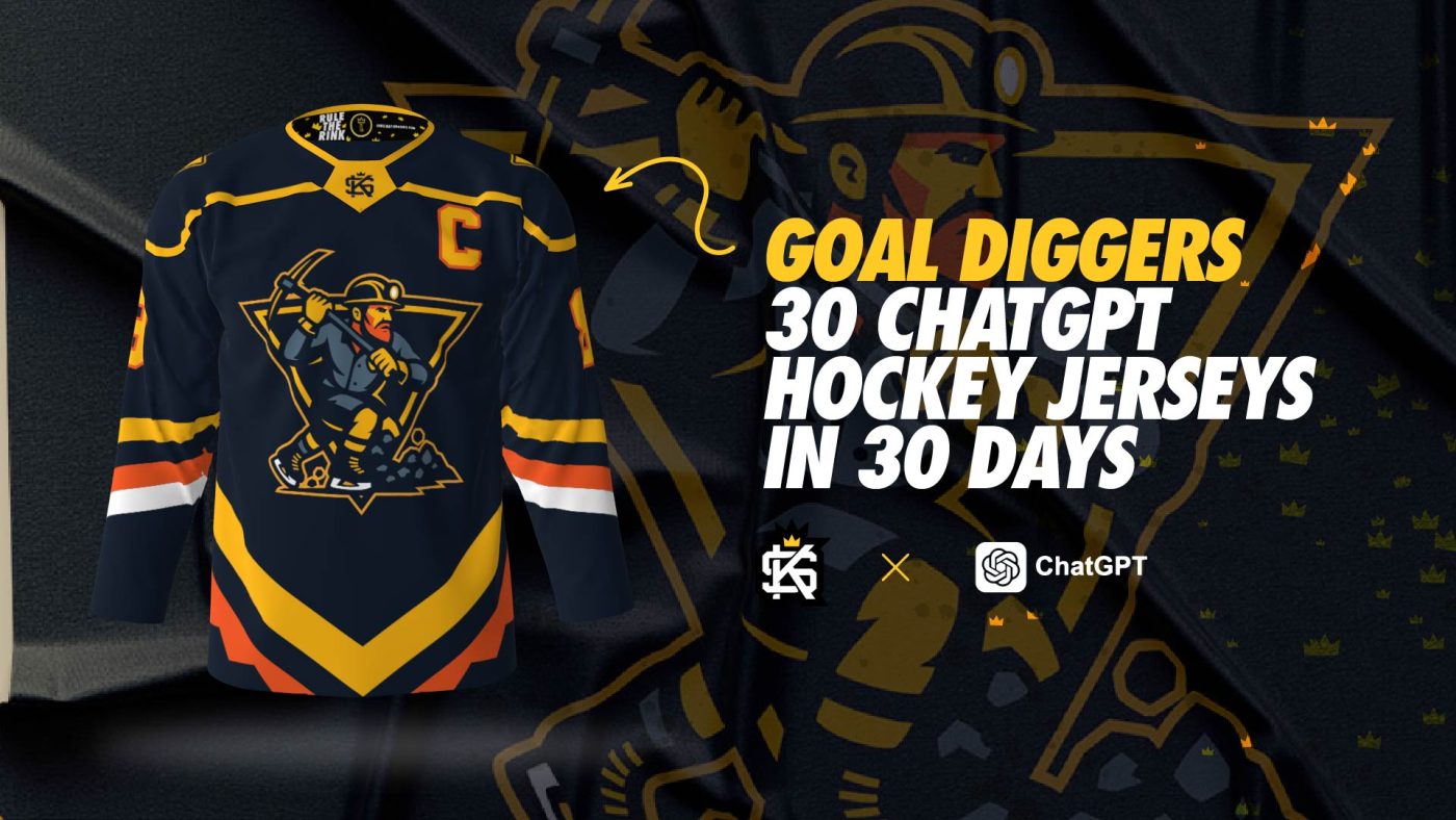
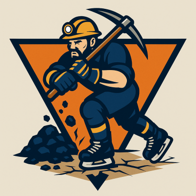
Welcome to the seventh installment of the series! Day 7 of 30. This particular concept revolved around the common team name of ‘Goal Diggers‘. A big burly miner swinging that axe around digging for goals.
How We Prompted ChatGPT
This is the exact prompt we used to start the process of generating the logo featured in this post.
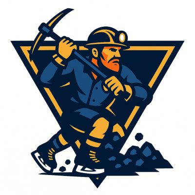
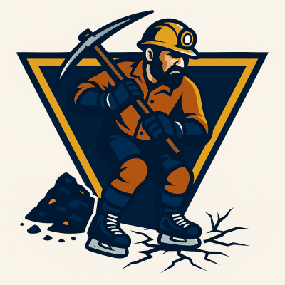
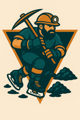
‘I want to make a logo for a hockey team called ‘Goal Diggers’ – want it to be a mascot logo in a modern style. Want the crest to be a symmetrical triangle in shape. For the logo mascot, please make it look like a typical coal miner in terms of what they wear in the mines. Have him swinging a pickaxe. Have coal piles and evidence of digging where the coal was by the feet. Should be wearing ice hockey skates, ice hockey gloves. Pick colors for me. Please only use a maximum of 5 to 6 contrasting hex colors for the logo. Logo only, don’t include the text please. Color should be clean sharp/smooth and polished, not grainy or mottled, no gradients blends or soft edges.’
Links to the prompt exchange history:
Final logo and uniform concept
For most use cases, we went with the minimal mascot style logo direction. ChatGPT knows what this is and will mimic the style pretty well. This ensures flat and clean lines with no shading or soft edges. That’s important, we’ll explain why. The final artwork needs to be this way so that we can create a vector image out of the PNG file that ChatGPT provides to you after it renders your ideas. We take the file and load it into a vectorization tool (we recommend vectorizer.ai and Vector Magic to accomplish this on your own – otherwise we can do that step for you after you order – you’re also free to explore other options) to separate the shapes into vectors so that we can colorize freely. This also ensures that we are able to scale the artwork without the loss of resolution. More on that here.
You can request a crest shape to act as a container for your logo, or explicitly ask to not include one. At times we asked for no crest shape since we wanted to have control on that piece on our end after the logo is created. You can also prompt ChatGPT for suggestions – it can really help steer your creative direction.
Be sure to direct the prompt with specific information if you have it – like what sort of emotion you want, what pose, overall shape, and what items the logo should have (i.e. hockey gloves, hockey skates, hockey stick, etc.).
For text, it does a decent job with rendering it out – you will likely experience some anomalies and artifacts with the text, it’s improved in this regard immensely in the time we started using to now. You can choose to let it be generated or to exclude it – just be sure to know what you want to do going into it. We suggest going without it first and adding it when requesting revisions. Experimenting will obviously get you better and better results as you learn how best to get what you want.
Ask for colors you’d like to include. Give general direction with terms like primary, analogous, monochromatic, contrasting – you can even let ChatGPT pick them for you. It’s good to limit the total number of colors in the logo as well – this helps for many reasons. Results in a cleaner file and better contrast. We recommend a maximum of 5-6 colors. Through some experimentation we found that adding the ‘no grain or mottled results’ in the prompt really helps to keep the final image from looking like it has a texture to it.
Final Goal Diggers Hockey Jersey Results/Product
This project came early in our ChatGPT journey. At first, we tried to make the pickaxe resemble a hockey stick—but those attempts introduced their own unique problems and just didn’t work visually. Using the prompt above (and many variations), we explored the idea across 10–15 different chats. Most results shared a similar execution, with only two or three standing out as strong options.
Some concepts included awkward coal piles or strange “holes” meant to represent digging—definitely learning moments. We did like the versions that featured cracks beneath the skate, but ultimately decided to head in a different direction.
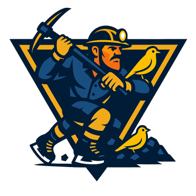
The shoulder patches were actually a spin-off idea. We originally thought a “canary in a coal mine” would make a great detail in the crest background. Once we tried it, though, it didn’t land quite the way we envisioned—so we pivoted and created shoulder patches instead.
We tested a wide range of variations to see what ChatGPT could deliver, and this is the version we ultimately chose. Aside from a few small tweaks, we mostly stayed true to the AI’s output. You’ll find additional logo variations from the process in the gallery below. It wasn’t easy picking a final design, but we’re really happy with where we landed.
Just to reiterate—this was a creative experiment to explore what AI can do, not a replacement for real illustrators.
We’re releasing a new design concept every day, so be sure to check out the rest of the collection as it grows. Feel free to order your favorite, share your results, and let us know what you think!
